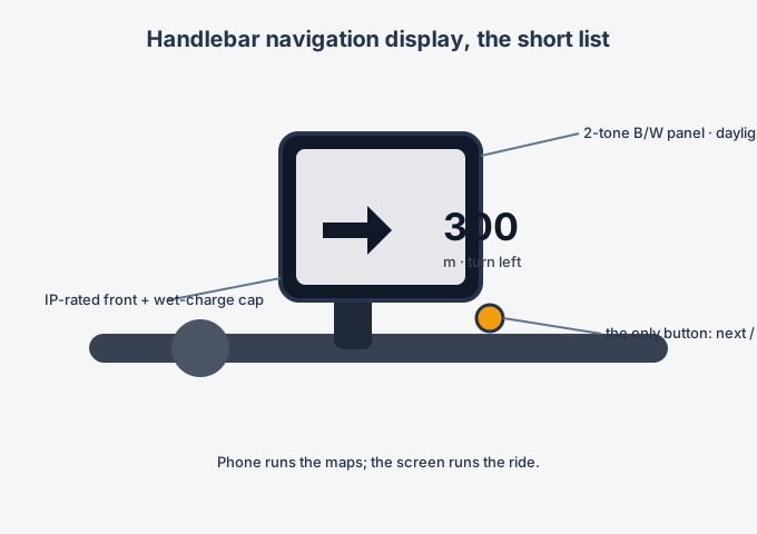
Handlebar navigation displays have quietly become one of the most disciplined product categories in consumer hardware. The brief almost writes itself: a large two-tone screen that is readable in direct sun, sealing that survives rain and washing, exactly one physical button, and a phone app doing all the actual computing. Everything on the bike is display; everything clever lives in your pocket.
Why monochrome wins on a bike
Colour TFTs fight sunlight with brightness, and brightness costs power and money. Two-tone memory-in-pixel or transflective panels are readable at noon without backlight, sip current, and match the glance-and-go reading pattern of riding: high contrast shapes, arrows and numbers, no maps that need study.
Waterproofing decides the enclosure
Rain riding and bike washing set the bar. The display front is the easy part; the charge port is the hard one — wet-state charging means a sealed cap or contactless charging, and every cable entry needs a gasketed, serviceable design. Vibration is the quiet killer: connectors locked, no press-fit assumptions.
One button is an interaction philosophy
Gloves cannot type. The single button advances through the few states the rider needs — start, next instruction, dismiss — and everything else is set in the app before the ride. Designing the state machine to fit one button forces the whole product to stay simple.
Where the OEM decisions concentrate
Screen size versus power budget, panel technology for sunlight and cold, enclosure sealing architecture, the mount (handlebar clamp versus mirror-stem), and the wireless link to the phone. The electronics are modest; the discipline is not.